Where to Blitz the Gap — a walkthrough¶
What is in the tool, and why is it built the way it is.
Where to Blitz the Gap is a companion planning tool for the Canada-wide Blitz the Gap iNaturalist bioblitz. It turns one question — "where should I go to record biodiversity so my observation adds the most to what we know about the natural world?" — into a map you can weight, explore, and plan a real low-carbon trip on.
The methodology and the data underneath it, laid out so you can check every choice and
reproduce every number. For the terse formula reference and the glossary, see
METHODOLOGY.md.
A work-in-progress prototype and a planning aid, not ground truth. The responsible-use guardrails are in the last section.
Each section pairs a design decision with the real data it acts on. Everything below runs from the committed build — re-execute top to bottom to reproduce every figure.
0 · Zoom out — the whole tool in one picture¶
How a question becomes a map you can act on:
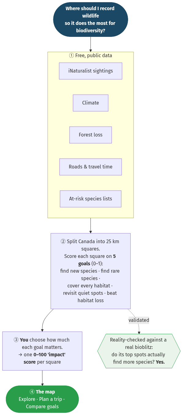
In one breath: the tool turns six free, public datasets (no logins, no private files) into a score for every 25 km square of Canada, lets you weight what "worth visiting" means, and points you to the best spot you can actually reach — and its choices are checked against a real bioblitz, not just asserted. The rest of this notebook opens each box: what's in a square, why each goal is scored the way it is, and the evidence behind the headline.
Mermaid source (diagram above)
flowchart TB
  Q(["Where should I record wildlife
so it does the most for biodiversity?"])
  subgraph DATA["① Free, public data"]
    direction LR
    D1["iNaturalist sightings"]
    D2["Climate"]
    D3["Forest loss"]
    D4["Roads & travel time"]
    D5["At-risk species lists"]
  end
  GOALS["② Split Canada into 25 km squares.
Score each square on 5 goals (0–1):
find new species · find rare species ·
cover every habitat · revisit quiet spots · beat habitat loss"]
  IMPACT["③ You choose how much each goal matters.
→ one 0–100 'impact' score per square"]
  APP(["④ The map
Explore · Plan a trip · Compare goals"])
  CHECK{{"Reality-checked against a real bioblitz:
do its top spots actually find more species? Yes."}}

  Q --> DATA --> GOALS --> IMPACT --> APP
  GOALS -. "validated" .-> CHECK

  style Q fill:#1b4965,color:#fff,stroke:#1b4965
  style APP fill:#2a9d4a,color:#fff,stroke:#2a9d4a
  style CHECK fill:#eaf4ea,stroke:#2a9d4a
Under the hood — the modules a developer would touch
| Module | Responsible for |
|---|---|
build_fullgrid_ca.py |
The four raster goals per square — discover, habitat coverage, urgency, travel — plus n_train. Defines the grid + land mask. |
build_atrisk_layer.py, joined in fullgrid_fields.py |
The rare-species goal: CAN-SAR (COSEWIC/SARA) species × their GBIF occurrences → per-square status-weighted at-risk richness, aggregated to 25 km. |
cluster DuckDB → ca_inat_metrics.csv → ca_staleness.csv |
The freshness goal: all-time vs last-5-years iNaturalist density per square. |
build_webapp.py |
The single source of truth for the app. Combines the five goals into impact, holds every UI string (EN/FR), the trip planner, and emits index.html. |
build_provenance.py |
Freezes the national build to a hashed manifest (provenance.json). |
voi_backtest.py, backtest_appscore.py |
The validation layer: do gap-filling priorities actually discover more than going where it's already busy? |
# Setup — all paths relative to the repo root (run this notebook from there).
import json, warnings
from pathlib import Path
import numpy as np, pandas as pd
import matplotlib.pyplot as plt
from matplotlib import colors as mcolors
warnings.filterwarnings("ignore")
plt.rcParams.update({"figure.dpi": 110, "font.size": 10, "axes.grid": False})

CA = Path("cluster_results/ca")
RES = Path("cluster_results")
INDEX = json.load(open(CA / "index.json"))
PROV  = json.load(open(CA / "provenance.json"))

# row_format from the shipped index — the contract every webapp_data_*.json obeys.
COLS = INDEX["row_format"]            # [lat,lon,discover,conservation,env,staleness,urgency,travel_min,n_train]
from goal_presets import AXES     # the one definition, shared with the app build
print("row format :", COLS)
print("axes       :", AXES)

def load_group(group="All biodiversity"):
    d = json.load(open(CA / f"webapp_data_{group.replace(' ', '_')}.json"))
    rows = d[list(d)[0]]
    return pd.DataFrame(rows, columns=COLS)

ALL = load_group("All biodiversity")
print(f"loaded {len(ALL):,} cells × {len(COLS)} columns for 'All biodiversity'")

# A reusable Canada scatter-map used throughout. Cells are points on the 25 km lattice;
# small squares read as a surface. ASPECT ~ 1/cos(59°N) keeps Canada from looking stretched.
LON, LAT = ALL["lon"].to_numpy(), ALL["lat"].to_numpy()
ASPECT = 1.7
def canada_map(ax, values, title, cmap="magma", vmax=None):
    ax.scatter(LON, LAT, c=values, s=2.0, marker="s", cmap=cmap, vmin=0, vmax=vmax, linewidths=0)
    ax.set_title(title, fontsize=10)
    ax.set_xticks([]); ax.set_yticks([]); ax.set_aspect(ASPECT)
    for s in ax.spines.values(): s.set_visible(False)

ALL.head(3)
row format : ['lat', 'lon', 'discover', 'conservation', 'env', 'staleness', 'urgency', 'travel_min', 'n_train']
axes       : ['discover', 'conservation', 'env', 'staleness', 'urgency']
loaded 23,214 cells × 9 columns for 'All biodiversity'
| lat | lon | discover | conservation | env | staleness | urgency | travel_min | n_train | |
|---|---|---|---|---|---|---|---|---|---|
| 0 | 82.237 | -56.121 | 0.981 | 0.0 | 0.966 | 1.0 | 0.0 | 8393.0 | 0 |
| 1 | 82.099 | -54.954 | 0.990 | 0.0 | 0.981 | 1.0 | 0.0 | 8614.0 | 0 |
| 2 | 81.957 | -53.826 | 0.996 | 0.0 | 0.993 | 1.0 | 0.0 | 8410.0 | 0 |
1 · What's in it — contents at a glance¶
Everything is one fixed geometry reused across life groups. A cell is the atom: a 25 km equal-area square of Canadian land carrying five priority axes plus travel cost. The app also serves a 5 km tier, which is the same lattice split 5×5; this walkthrough reads the 25 km tier.
lat = INDEX["lattice"]
print(f"Grid          : {INDEX['n_cells']:,} cells of {INDEX['res_m']//1000} km ({lat['cell_km2']:.0f} km² each)")
print(f"Lattice       : {lat['ncol']} × {lat['nrow']} equal-area cells (all of Canada + a US land sliver)")
print(f"Life groups   : {len(INDEX['groups'])} → {', '.join(INDEX['groups'])}")
print(f"Per cell      : 5 axes (0–1) + travel_min + n_train")
print(f"Provenance    : {PROV['manifest_hash'][:16]}…  ({len(PROV['files'])} files frozen)")

# Verify the axes are REAL in the actual data (not from the doc, not from stale metadata):
print("\nAxis reality check (from the shipped data itself):")
for ax in AXES:
    col = ALL[ax].to_numpy(float)
    nz = (col != 0).mean()
    print(f"  {ax:13s} range [{col.min():.2f}, {col.max():.2f}]  nonzero in {nz*100:5.1f}% of cells")
stale_corr = np.corrcoef(ALL['discover'], ALL['staleness'])[0,1]
print(f"\n  staleness is NOT a copy of discover  →  corr(discover, staleness) = {stale_corr:+.3f}")
print(f"  conservation is a real sparse layer →  {(ALL['conservation']>0).sum():,} cells carry at-risk richness")
Grid          : 23,214 cells of 25 km (625 km² each)
Lattice       : 220 × 181 equal-area cells (all of Canada + a US land sliver)
Life groups   : 11 → All biodiversity, Plantae, Insecta, Aves, Fungi, Mammalia, Actinopterygii, Reptilia, Amphibia, Arachnida, Mollusca
Per cell      : 5 axes (0–1) + travel_min + n_train
Provenance    : f67acf37faa748c9…  (29 files frozen)

Axis reality check (from the shipped data itself):
  discover      range [0.00, 1.00]  nonzero in 100.0% of cells
  conservation  range [0.00, 1.00]  nonzero in  10.5% of cells
  env           range [0.00, 1.00]  nonzero in 100.0% of cells
  staleness     range [0.00, 1.00]  nonzero in  79.7% of cells
  urgency       range [0.00, 1.00]  nonzero in  57.1% of cells

  staleness is NOT a copy of discover  →  corr(discover, staleness) = +0.768
  conservation is a real sparse layer →  2,440 cells carry at-risk richness
2 · The data¶
Six public sources, each chosen because it is fetchable without credentials and national in coverage — a hard constraint, because the tool must be reproducible by anyone and must not depend on the private McGill iNat-Canada parquet.
| Axis | Source | What it is | Resolution | Licence / access |
|---|---|---|---|---|
| discover | iNaturalist observation density (Biodiversité Québec STAC) | per-group "light up the map" record density — the same surface the official project uses | 1 km COG | public COG on Arbutus |
| conservation | CAN-SAR (COSEWIC/SARA) × GBIF | 521 at-risk species × their Canadian occurrences | point → 25 km | CC-BY (OSF 10.17605/OSF.IO/E4A58) + public GBIF |
| env | CHELSA bioclimate | temperature, seasonality, precipitation | ~1 km | public (/vsicurl) |
| staleness | iNaturalist open-data dump | per-record dates → all-time vs recent | per-record | public AWS dump |
| urgency | Hansen Global Forest Change | forest-loss fraction (logging / fire / dieback) | 0.05° | public |
| travel | Weiss et al. 2018 accessibility | minutes to the nearest city | ~1 km | public (MalariaAtlas) |
A subtle but load-bearing data choice: the land mask. A cell is kept if it sits inside the iNat density COG footprint and either the Weiss raster calls it land or it carries records. Cells outside the COG are dropped rather than shown as false gaps. The grid is a decision, not a given.
2.1 · Why the map spills into the United States¶
One thing you notice immediately: there is real data across Washington, Oregon, Idaho, Montana, the Dakotas, Minnesota, Michigan, and Maine. That is not a bug, but it is a known consequence of two deliberate choices, worth being explicit about:
- The lattice is a rectangle in projected space, and its southern edge reaches ~41°N so that Canada's southernmost hotspots are covered — Point Pelee (41.9°N), the Carolinian zone, southern Vancouver Island. Reaching that far south scoops up a band of the northern US.
- The land mask is geographic, not political.
build_fullgrid_ca.pykeeps a cell if the Weiss travel-time raster says it's land (ocean = nodata) — it does not clip to the Canada polygon. The Natural Earth refinement only removed ocean and Greenland, keeping Canada and US land.
The important honesty point is what the US data is and isn't: the density layer is the
Canada-focused inat_canada_heatmaps COG. Its footprint spills a little across the border,
but the overwhelming majority of US cells sit outside the Canadian recording layer — so
they read as "gaps" largely because the Canadian density layer stops at the border, not
because they are genuinely under-recorded. (Deep-US cells outside the COG are dropped by the
mask.) The figure quantifies it.
The sharp horizontal seam along ~49°N is this, made visible — it's a data-footprint edge, not ecology. North of the border the Canadian density COG has records, so cells score on real data (varied, mostly well-sampled). South of it the COG is empty, so every US cell defaults into the same max-under-sampling bucket (differentiated only by climate) — a flat band with a hard top edge. The transect below confirms it: density jumps from ~0 to thousands and zero-observation cells go 95% → 0% across 48–49°N. A clip to the Canada polygon removes both the US band and the seam in one move.
us_west = (ALL["lon"] < -95) & (ALL["lat"] < 49.0)         # clearly-US band (W of -95, S of the 49th-parallel border)
n_us = int(us_west.sum()); n_us_rec = int((us_west & (ALL["n_train"] > 0)).sum())

fig, ax = plt.subplots(figsize=(8.5, 4.6))
ax.scatter(ALL.lon[~us_west], ALL.lat[~us_west], s=2, marker="s", color="#cbd5e0", label="Canadian / border cells")
ax.scatter(ALL.lon[us_west],  ALL.lat[us_west],  s=2, marker="s", color="#c0392b", label="clearly-US cells")
ax.axhline(49, color="#2c3e50", lw=0.8, ls="--"); ax.text(-138, 49.4, "49°N border", fontsize=8, color="#2c3e50")
ax.set_aspect(ASPECT); ax.set_xticks([]); ax.set_yticks([])
for s in ax.spines.values(): s.set_visible(False)
ax.legend(loc="lower left", fontsize=9, markerscale=4)
ax.set_title(f"{n_us:,} cells (~{us_west.mean()*100:.0f}%) are clearly US — but only {n_us_rec} carry iNaturalist records")
plt.tight_layout(); plt.show()
print(f"Clearly-US cells: {n_us:,}  ·  of those with real iNat records: {n_us_rec}")
print("→ Most US cells are gaps only because the Canadian density COG stops at the border.\n")

# Transect across the western border (lon -125..-100): the seam at ~49°N is the COG edge.
band = (ALL.lon > -125) & (ALL.lon < -100)
print("Transect across the 49°N border (the visible seam):")
print(f"{'lat':>6} {'n_train':>9} {'%zero-obs':>10} {'discover':>9}")
for lo in [47.5, 48.0, 48.5, 49.0, 49.5]:
    m = band & (ALL.lat >= lo) & (ALL.lat < lo + 0.5)
    side = "US " if lo < 49 else "CA "
    print(f"{side}{lo:5.1f} {ALL.n_train[m].mean():9.0f} {(ALL.n_train[m]==0).mean()*100:9.0f}% {ALL.discover[m].mean():9.2f}")
print("→ density 0→thousands and zero-obs 95%→0% across the line = a data-footprint edge, not ecology.")

Clearly-US cells: 2,772  ·  of those with real iNat records: 140
→ Most US cells are gaps only because the Canadian density COG stops at the border.

Transect across the 49°N border (the visible seam):
   lat   n_train  %zero-obs  discover
US  47.5         0        99%      0.62
US  48.0      1948        91%      0.56
US  48.5      5572        44%      0.36
CA  49.0     10895         0%      0.09
CA  49.5      3192         0%      0.10
→ density 0→thousands and zero-obs 95%→0% across the line = a data-footprint edge, not ecology.
3 · The five goals — what each one looks like over Canada¶
Every square is scored from 0 to 1 on five goals (we call them axes in the code). The code names are terse, so here is what each one means before you see it on a map:
| Axis (code name) | The goal, in plain English | A high score means |
|---|---|---|
discover |
Go where few people have looked | Hardly any iNaturalist records nearby |
conservation |
Go where at-risk species live | Many threatened species recorded around the square |
env |
Cover every habitat | The square's climate type is barely sampled anywhere |
staleness |
Revisit places that have gone quiet | Lots of old records, very few recent ones |
urgency |
Record it before it's lost | Recent forest-cover loss (logging, fire, dieback) |
Below they are side by side — read each map as "where would this goal send me?" They send you to different places, which is exactly why you get to choose between them (§6). Each goal below opens with a one-line plain-English version, then the exact method and the design choice behind it.
titles = {
    "discover":     "Discover\n(under-sampled)",
    "conservation": "Find rare species\n(at-risk richness)",
    "env":          "Cover every habitat\n(climate surprisal)",
    "staleness":    "Freshest gaps\n(quiet lately)",
    "urgency":      "Sample before it's lost\n(forest loss)",
}
fig, axs = plt.subplots(1, 5, figsize=(15, 3.6))
for ax, k in zip(axs, AXES):
    canada_map(ax, ALL[k], titles[k], cmap="magma")
fig.suptitle(f"The five priority axes — 'All biodiversity', {len(ALL):,} real cells (darker = higher priority)", y=1.02)
plt.tight_layout(); plt.show()

3.1 · Discover — and the de-saturation choice¶
In plain terms: go where few people have looked. A square scores high if hardly anyone has recorded there on iNaturalist.
Measures: how under-sampled a square is — fewer records, higher discover.
The choice (why it's a ranking, not just "1 ÷ records"). The obvious formula is
norm(1 / (density + ε)). We don't ship it. On the
real national density it is violently bimodal: ~half the cells have zero research-grade
records and pin at 1.0, while every recorded cell collapses to near-zero — the map becomes a
binary "recorded / not", with no gradient to plan a trip on. The shipped axis is instead a
smooth under-sampling rank, with zero-observation ties broken by climate distinctiveness
(env). The figure shows why the rank is the better content.
# n_train ≈ density × cell-area, so it's a faithful stand-in for the raw density the
# naive formula would have used. Compare the naive saturating transform to the shipped rank.
dens = ALL["n_train"].to_numpy(float)
naive = 1.0 / (dens + 1e-3)
naive = (naive - naive.min()) / (naive.max() - naive.min())   # min–max norm(1/density)
shipped = ALL["discover"].to_numpy(float)                      # the de-saturated rank

fig, axs = plt.subplots(1, 3, figsize=(14, 3.8))
axs[0].hist(naive, bins=60, color="#c0392b"); axs[0].set_title("Naive  norm(1/density)\nbimodal: a binary mask")
axs[0].set_xlabel("axis value"); axs[0].set_ylabel("cells")
axs[1].hist(shipped, bins=60, color="#2980b9"); axs[1].set_title("Shipped  under-sampling rank\nsmooth: a plannable gradient")
axs[1].set_xlabel("axis value")
canada_map(axs[2], shipped, "Shipped discover over Canada", cmap="magma")
frac_pinned = (naive > 0.99).mean()
fig.suptitle(f"Why a rank, not 1/density:  {frac_pinned*100:.0f}% of cells pin at the max under the naive transform", y=1.03)
plt.tight_layout(); plt.show()

3.2 · Find rare species — and the dual-use safety choice¶
In plain terms: go where Canada's species-at-risk live. A square scores high if many threatened species have been recorded in the surrounding area.
Measures: how many of Canada's at-risk species occur in a cell — "Canada's Most Wanted." Formula: per cell, sum status weights of at-risk species recorded there (Endangered 3 · Threatened 2 · Special Concern 1), then min–max to 0–1.
The choice that defines this axis is what we refuse to expose. Pollock et al. 2025
(Nat Rev Biodiversity, Box 3) warns that fine-grained "where do threatened species occur"
maps can aid poaching and collection. So the underlying CAN-SAR × GBIF point occurrences are
aggregated away in build_atrisk_layer.py; only a per-cell sum of status weights over a
25 km cell ever reaches the public app. It says "this region is rich in at-risk species,"
never which species or where within the cell. Coarse binning + all-taxa pooling are the
mitigation, and they stay in force for any future finer layer.
cons = pd.read_csv(CA / "ca_atrisk_richness.csv")
top = cons.nlargest(8, "n_species").reset_index(drop=True)

def name_place(lat, lon):
    spots = [("Point Pelee / Carolinian SW Ontario", 42.0, -82.5),
             ("Southern Vancouver Island / Garry Oak", 48.5, -123.4),
             ("Okanagan", 49.9, -119.5), ("Lower Mainland BC", 49.2, -122.5),
             ("Niagara / Golden Horseshoe", 43.1, -79.4), ("Montréal / St. Lawrence", 45.5, -73.6)]
    return min(spots, key=lambda s: (s[1]-lat)**2 + (s[2]-lon)**2)[0]
top["likely region"] = [name_place(r.lat, r.lon) for r in top.itertuples()]
# Region first, with explicit widths, so its long labels get the room and never clip the right edge.
top = top[["likely region", "n_species", "lat", "lon"]]

fig, axs = plt.subplots(1, 2, figsize=(12, 4.2))
canada_map(axs[0], ALL["conservation"], "Conservation axis (25 km, all-taxa pooled)", cmap="magma")
axs[1].axis("off")
axs[1].set_title("Top at-risk-richness cells = Canada's real hotspots", fontsize=10)
tbl = axs[1].table(cellText=top.round(2).values, colLabels=top.columns, loc="center",
                   cellLoc="left", colWidths=[0.52, 0.16, 0.16, 0.16])
tbl.auto_set_font_size(False); tbl.set_fontsize(8); tbl.scale(1, 1.5)
fig.suptitle("Find rare species — concentrated, validated against known hotspots, deliberately coarse", y=1.0)
plt.tight_layout(); plt.show()
print("Caveat: reflects ASSESSED species only (CAN-SAR ~2021); IUCN/COSEWIC under-assess inverts, plants, fungi.")

Caveat: reflects ASSESSED species only (CAN-SAR ~2021); IUCN/COSEWIC under-assess inverts, plants, fungi.
3.3 · Cover every habitat — sampling Canada's rarest climates¶
In plain terms: go where the climate itself is barely recorded. Some climate types — a particular cold, wet, coastal mix, say — are hardly sampled anywhere in Canada. A square with such a climate scores high even if it sits next to a city.
Measures: how under-sampled a square's climate type is (not its location). How: we describe each square by three CHELSA numbers (temperature, how much it swings through the year, and rainfall), then ask "how many already-recorded places have a climate like this one?" Few similar recorded places → high score. (Technically this is climate surprisal: a density estimate in 3-D climate space, mapped to 0–1 through a national ramp — a rarely-seen climate is "surprising," so it scores high.)
The choice: a geographic gap is not the same as a climate gap. Scoring climate rarity rather than distance keeps this goal genuinely different from "discover" — we check that in §6.
fig, axs = plt.subplots(1, 2, figsize=(12, 3.8))
canada_map(axs[0], ALL["env"], "How rare each square's climate is", cmap="magma")
axs[1].hist(ALL["env"], bins=60, color="#16a085")
axs[1].set_title("Mapped through the national ramp → uses the full 0–1 range"); axs[1].set_xlabel("env"); axs[1].set_ylabel("cells")
plt.tight_layout(); plt.show()

3.4 · Freshest gaps — and the iNat-only data-integrity choice¶
In plain terms: revisit places that were busy once but have gone quiet. A square that people recorded heavily years ago but barely touch now scores high — its picture is going stale.
Measures: squares well-recorded in the past but quiet lately. Formula: for squares
with ≥20 historical records, staleness = (1 − recent/all-time) · log(1 + all-time records),
scaled 0–1. Lots of old records + few recent ones → high.
The choice, caught by cross-validation. An earlier version sourced this from GBIF density. But GBIF blends iNaturalist + eBird + museum specimens — eBird's recent bird volume and museums' old specimens distort "where iNaturalist users have gone quiet." A cluster cross-validation against the raw iNat dump found the GBIF signal was null (ρ ≈ −0.065) and the axis was re-sourced to iNaturalist-only. This is the discipline the project runs on: an un-validated layer is not trusted into the map.
met = pd.read_csv(CA / "ca_inat_metrics.csv")
# Show staleness is a genuinely distinct signal, and surface a concrete "quiet now" cell.
fig, axs = plt.subplots(1, 2, figsize=(12, 4.0))
s = ALL.sample(6000, random_state=0)
axs[0].scatter(s["discover"], s["staleness"], s=4, alpha=0.25, color="#8e44ad")
axs[0].set_xlabel("discover (under-sampled)"); axs[0].set_ylabel("staleness (quiet lately)")
r = np.corrcoef(ALL["discover"], ALL["staleness"])[0,1]
axs[0].set_title(f"Distinct, not a mirror — corr = {r:+.2f}\n(well-recorded ≠ recently-recorded)")
busy_then_quiet = met[(met.n_all >= 200)].assign(recent_frac=lambda d: d.n_recent/d.n_all).nsmallest(8, "recent_frac")
axs[1].axis("off"); axs[1].set_title("Recorded a lot all-time, almost nothing recently", fontsize=10)
show = busy_then_quiet[["lat","lon","n_all","n_recent"]].round(2) if "lat" in busy_then_quiet else busy_then_quiet[["n_all","n_recent"]]
t = axs[1].table(cellText=show.values, colLabels=show.columns, loc="center"); t.auto_set_font_size(False); t.set_fontsize(8); t.scale(1,1.5)
plt.tight_layout(); plt.show()

3.5 · Sample before it's lost — recent habitat change¶
In plain terms: record it before it's gone. A square scores high where forest cover has recently been lost (logging, fire, dieback).
Measures: recent forest-cover loss. Formula:
urgency = normalize(Hansen forest-loss fraction), 0–1. High = recent loss (logging, fire,
dieback — Hansen measures loss of any cause, deliberately not labelled "deforestation").
The Fort McMurray fire scar scores ~0.75; saturated southern cities ~0.
fig, ax = plt.subplots(figsize=(7.5, 4.2))
canada_map(ax, ALL["urgency"], "Urgency — Hansen forest-loss fraction", cmap="magma")
plt.tight_layout(); plt.show()
fm = ALL.iloc[((ALL.lat-56.7)**2 + (ALL.lon+111.4)**2).idxmin()]
print(f"Fort McMurray-area cell urgency = {fm.urgency:.2f}  (vs national median {ALL.urgency.median():.3f})")

Fort McMurray-area cell urgency = 0.64 (vs national median 0.002)
4 · The score — "impact 0–100"¶
In plain terms: pick a preset to say which goals matter to you. Each square then gets a single 0–100 score in its popup, where 100 is the highest-priority square on the map for your current settings and life group.
How it's built:
- Blend — multiply each goal's 0–1 value by the preset's weight and add them up
(
raw = w₁·discover + w₂·rare + …). A square strong on the goals you care about gets a big raw number. - Colour — the map paints that blended value itself, cut off at 1 and run through the viridis ramp. It is baked into a PNG per life group and goal at build time, so panning and zooming never change a square's colour.
- Rank — the popup shows the square's place in the line as 0–100. Top square → 100, bottom → 0, across all squares of the selected life group in Canada.
Why the cut-off matters (the key choice). A few Arctic squares are off-the-charts gaps. If we stretched the scale between the lowest and the highest square, those few would push every other square — including everywhere you could actually reach — to the same dull near-zero, and the map would say "nowhere matters," which is false and useless. The figure shows the same blended score stretched (left) and ranked (right).
from goal_presets import DEFAULT              # the shipped default preset, not a copy of it
raw = sum(w * ALL[a].to_numpy(float) for a, w in zip(AXES, DEFAULT) if w)
minmax = (raw - raw.min()) / (raw.max() - raw.min()) * 100
order = raw.argsort(); pct = np.empty_like(raw); pct[order] = np.linspace(0, 100, len(raw))

fig, axs = plt.subplots(2, 2, figsize=(12, 7.4))
canada_map(axs[0,0], minmax, "If we stretched the raw total", cmap="magma", vmax=100)
canada_map(axs[0,1], pct,    "Ranked: what the popup reports", cmap="magma", vmax=100)
axs[1,0].hist(minmax, bins=60, color="#c0392b"); axs[1,0].set_title("Stretched: a few Arctic gaps crush everything to ~0"); axs[1,0].set_xlabel("score 0–100"); axs[1,0].set_ylabel("squares")
axs[1,1].hist(pct, bins=60, color="#27ae60"); axs[1,1].set_title("Ranked: full 0–100 range, usable for planning"); axs[1,1].set_xlabel("score 0–100")
crushed = (minmax < 5).mean()
fig.suptitle(f"Same blended score, two ways to scale it — stretching pins {crushed*100:.0f}% of squares below 5/100", y=1.0)
plt.tight_layout(); plt.show()

5 · Presets — value choices, made explicit and linked to real challenges¶
A where-to-go map is a value choice, not a measurement: discovery, conservation, and habitat coverage point to different places. Rather than hide that behind one "best" map, the app ships a small set of named presets, each linked to a real, verified Blitz the Gap iNaturalist sub-project so the planning tool and the campaign stay in sync.
# straight from goal_presets.py, the same list build_webapp.py injects into index.html
from goal_presets import PRESETS
pd.set_option("display.max_colwidth", 60)
pdf = pd.DataFrame([(p["name"], *p["w"], p["proj"]) for p in PRESETS],
                   columns=["preset",*AXES,"iNat project"])
display(pdf)

# Two presets, two genuinely different maps — same geometry, different weighting.
def impact_pct(weights):
    raw = sum(weights[i]*ALL[AXES[i]].to_numpy(float) for i in range(5))
    o = raw.argsort(); p = np.empty_like(raw); p[o] = np.linspace(0,100,len(raw)); return p
fig, axs = plt.subplots(1, 3, figsize=(14, 3.8))
for ax,p in zip(axs, PRESETS):
    canada_map(ax, impact_pct(p["w"]), p["name"], cmap="magma", vmax=100)
fig.suptitle("Same cells, different values \u2192 different trips (" + " \u00b7 ".join(p["name"] for p in PRESETS) + ")", y=1.03)
plt.tight_layout(); plt.show()
| preset | discover | conservation | env | staleness | urgency | iNat project | |
|---|---|---|---|---|---|---|---|
| 0 | Spatial Gap | 1.0 | 0.0 | 0 | 0.0 | 0.0 | blitz-the-gap-2026-general |
| 1 | Species discovery | 1.0 | 0.0 | 0 | 0.6 | 0.0 | blitz-the-gap-2026-general |
| 2 | Conservation | 0.0 | 1.0 | 0 | 0.0 | 0.4 | blitz-the-gap-2026-general |

6 · Do the goals actually point to different places?¶
In plain terms: if the five goals all sent you to the same squares, the presets would be for show. They don't. The grid below measures how much any two goals agree on where to go: +1 = the same places, 0 = unrelated, −1 = opposite places. Most pairs are near 0 or negative — they're genuinely different goals, which is why it's worth choosing between them.
(Computed over squares that actually have records, n_train > 0.)
A verification catch worth flagging: over the full grid, discover and habitat-coverage look ~0.9 "agree" — an artifact, because ~half the squares are empty gaps that pin discover at its max, so it can't vary. Restricting to recorded squares gives the honest, near-zero/negative picture. The number depends on which squares you include.
rec = ALL[ALL["n_train"] > 0]
M = rec[AXES].corr(method="spearman")
fig, ax = plt.subplots(figsize=(5.8, 5))
im = ax.imshow(M, cmap="RdBu_r", vmin=-1, vmax=1)
ax.set_xticks(range(5)); ax.set_yticks(range(5))
ax.set_xticklabels(AXES, rotation=40, ha="right"); ax.set_yticklabels(AXES)
for i in range(5):
    for j in range(5):
        ax.text(j, i, f"{M.iloc[i,j]:+.2f}", ha="center", va="center",
                color="white" if abs(M.iloc[i,j])>0.5 else "black", fontsize=9)
ax.set_title(f"How much each pair of goals agrees on where to go\n(+1 same places · 0 unrelated · −1 opposite; over {len(rec):,} recorded squares)")
fig.colorbar(im, fraction=0.046, pad=0.04); plt.tight_layout(); plt.show()

7 · From map to trip — how navigation works¶
In plain terms: the map tells you where the good squares are; the planner tells you which one you can actually get to and back from in the time you have — by the greenest way that still works. You give it your start and a time budget (say "Vancouver, 5 hours"); it finds the highest-impact square you can round-trip, picks walk/bike/drive for you, and draws the real route.
The choices that keep it honest:
- Travel only ever costs you — it never raises a square's score. A trip is ranked by how good the square is × how long you'd get to record there. Closer squares win partly because you spend less time travelling and more time recording — but being easy to reach never makes a square "better." That's deliberate: otherwise everyone gets sent to the same roadside spots and the gaps never get filled.
- Greenest mode that fits. It defaults to the greenest option — walk, then bike, then drive — that can still reach the square within your budget, decided from your start.
- Real routes, honest fallback. Walk/bike/drive routes come from real road data (OpenStreetMap routing). If a route can't be fetched, it falls back to a straight-line estimate and says so. Driving counts ≈ 0.18 kg CO₂ per km; walking and cycling, zero.
- "Worth the drive." By default a trip must let you record for at least half as long as you travel — so you don't get a 4-hour drive for 1 hour in the field.
(No figure here — this is interaction, not data — but it's the same discipline: every default is a defensible choice, and any estimated route is labelled.)
8 · Does the core idea actually work?¶
In plain terms: the whole tool bets that sending people to under-recorded squares turns up more new species than sending them where it's already busy. So we graded it like a weather forecast, against a real bioblitz after the fact.
How the test works (on the real 2025 BC pilot, iNat project 228908):
- Hide the future. Split each square's records in time. Build the map using only the earlier records.
- Score against what happened next. Count how many species new to that square showed up in the later records — the part the map never saw.
- Compare fairly. Check the same fixed number of later visits per square, so a square doesn't look better just because more people happened to go there.
If the map's high-priority squares are the ones that later turned up new species, the core idea holds. The bars below show the agreement (again: +1 = it nailed it, 0 = no better than chance, −1 = exactly wrong).
app = json.load(open(RES / "voi_appscore_results.json"))
rows = []
for r in app:
    s = r["scores"]
    rows.append({"taxon": r["taxon"],
                 "app (gap-filling)": s["app_leakfree"]["spearman"],
                 "what the map shows": s["app_shipped"]["spearman"],
                 "go-where-busy":     s["opportunistic_density"]["spearman"]})
# "discover only" is deliberately not a fourth bar: the default preset is discover 1.0 and
# nothing else, so discover_leakfree and app_leakfree are the same number.
bt = pd.DataFrame(rows).set_index("taxon")

fig, ax = plt.subplots(figsize=(9.5, 4.4))
bt.plot.bar(ax=ax, color=["#27ae60", "#2980b9", "#c0392b"], width=0.8)
ax.axhline(0, color="k", lw=0.8)
ax.set_ylabel("Agreement with what was discovered next\n(+1 nailed it · 0 chance · −1 exactly wrong)")
ax.set_title("Sending people to gaps finds more new species; sending them where it's busy finds fewer (mirror image)")
ax.legend(loc="lower right", fontsize=9); ax.set_xlabel("")
plt.xticks(rotation=0); plt.tight_layout(); plt.show()

m_app  = bt["app (gap-filling)"].mean()
m_ship = bt["what the map shows"].mean()
m_busy = bt["go-where-busy"].mean()
n_ship_sig = sum(r["scores"]["app_shipped"]["perm_p"] < 0.05 for r in app)
print(f"Average agreement — app's gap-filling map : {m_app:+.2f}  (correct on {bt['app (gap-filling)'].gt(0).sum()}/{len(bt)} animal groups)")
print(f"Average agreement — what the map shows     : {m_ship:+.2f}  (better than chance on {n_ship_sig}/{len(bt)} groups)")
print(f"Average agreement — 'go where it's busy'  : {m_busy:+.2f}  (the near-exact opposite)")

Average agreement — app's gap-filling map : +0.59  (correct on 5/5 animal groups)
Average agreement — what the map shows     : +0.27  (better than chance on 4/5 groups)
Average agreement — 'go where it's busy'  : -0.59  (the near-exact opposite)
Two findings worth naming:
The blue bar is the score the live map actually ranks squares by. The green bar is the leak-free score this test validates; the blue one is what you see in the app, and it is the weaker of the two on every animal group.
- The shipped score is weaker than the one that validates. The app's
discoveraxis is1/(all-time density), so a square that was just surveyed instantly looks "covered" and sheds priority. That is defensible when you are planning the next trip, but it costs agreement here: the blue bar beats chance on four of the five BC groups and is indistinguishable from random on amphibians. Pinning the shipped axis to a fixed snapshot or window is the open fix. - The signal lives entirely in the under-sampling axis. Spatial Gap, the default preset, is
discover1.0 and nothing else, so the leak-free score and the discover-only score are the same number and only one green bar is drawn.envandurgencyare near-uncorrelated with this objective, because they optimise other goals by design. - It replicates out of region. Re-running on a disjoint Eastern-Canada window (ON/QC/ Maritimes) reproduces the directed > opportunistic result — it is not a BC artifact.
# Replication on a disjoint region (Eastern Canada), same harness.
east = json.load(open(RES / "voi_appscore_east_results.json"))
er = pd.DataFrame([{"taxon": r["taxon"],
                    "app (gap-filling)": r["scores"]["app_leakfree"]["spearman"],
                    "go-where-busy":     r["scores"]["opportunistic_density"]["spearman"]}
                   for r in east]).set_index("taxon")
print("Eastern-Canada replication (disjoint from BC):")
display(er.round(2))
print(f"\nDirected stays positive on {er['app (gap-filling)'].gt(0).sum()}/{len(er)} eastern taxa → not a regional artifact.")
Eastern-Canada replication (disjoint from BC):
| app (gap-filling) | go-where-busy | |
|---|---|---|
| taxon | ||
| Aves | 0.59 | -0.59 |
| Insecta | 0.40 | -0.40 |
| Mammalia | 0.67 | -0.67 |
Directed stays positive on 3/3 eastern taxa → not a regional artifact.
9 · Responsible use¶
These constraints shaped the contents above; they are the reason some things are coarse or absent on purpose:
- Species-at-risk are gated out of suggestions. Every live iNaturalist fetch carries
taxon_geoprivacy=openand the "fill the gap" suggestions addthreatened=false. The tool will not point a stranger at a rare orchid. - The conservation axis is coarse by design (Section 3.2) — a 25 km, all-taxa sum, never a species map. Dual-use mitigation (Pollock et al. 2025, Box 3) stays in force for any finer future layer.
- Indigenous data sovereignty. Obscure sensitive locations and respect Indigenous data sovereignty before any public use; a territory acknowledgment is linked in-app.
- It is a prototype, flagged in-app, and a planning aid, not a census. iNaturalist counts are sampling effort, not ground-truth abundance, and are labelled that way throughout.
10 · How it's delivered — the stack¶
In plain terms: everything above is computed once and frozen into files. The website is those files. There is no server and no database, so nothing can quietly change under you.
Python builds the lattice and fills it; build_webapp.py inlines the result into one
self-contained index.html, byte-identical for the same inputs. The page is plain JavaScript
with MapLibre GL JS and pmtiles.js, on GitHub Pages. The five map layers are not the same
kind of thing, which is the one non-obvious part:
| Layer | Served as | Built by |
|---|---|---|
| Base map | XYZ raster tiles (CARTO / ArcGIS / OpenTopoMap) | — |
| Cell geometry | GeoJSON polygons, in the LAEA lattice of Section 2 | grid_lattice.py |
| Cell colours | One PNG per (group, goal, tier), one pixel per cell, painted onto those polygons | build_grid_values.py |
| Density overlay | Raster PMTiles, magma baked in at build time | build_density_pmtiles.py |
| Density, Fungi only | Live TiTiler over a 1 km COG on Arbutus | — |
Colours are a PNG rather than tiles because warping rotated LAEA cells into Mercator pixels left a staircase that never matched the lattice (#116). Fungi alone reads a live COG because it has no 100 m layer yet. Both docstrings carry the full reasoning.
11 · Reproduce everything¶
# 1. environment (no credentials needed; all sources public)
uv venv --python 3.11 .venv && uv pip install --python .venv/bin/python -r requirements.txt

# 2. regenerate the national build from cluster_results/ca/ (deterministic, byte-identical)
.venv/bin/python build_webapp.py          # → index.html

# 3. rebuild + execute THIS walkthrough, then render the HTML the in-app link points to
.venv/bin/python _build_walkthrough.py
.venv/bin/python -m nbconvert --to notebook --execute --inplace where-to-blitz-walkthrough.ipynb
.venv/bin/python render_walkthrough_html.py    # → where-to-blitz-walkthrough.html (adds figure alt text)
The build is frozen by a manifest hash (printed in Section 1); the validation results read from
cached cluster_results/*.json, re-pullable with pull_inat_backtest.py. Optional live cell
below shows the "tap a cell → what to record" loop on today's iNaturalist data.
# OPTIONAL — live iNaturalist "fill the gap" near a chosen cell. Guarded: skips cleanly offline.
import urllib.request
def fill_the_gap(lat, lon, radius_km=25):
    url = ("https://api.inaturalist.org/v1/observations/species_counts"
           f"?lat={lat}&lng={lon}&radius={radius_km}&quality_grade=research"
           "&taxon_geoprivacy=open&threatened=false&per_page=5")
    with urllib.request.urlopen(url, timeout=8) as r:
        return json.load(r)
try:
    # pick the highest-priority reachable-ish CANADIAN cell under the default preset
    # (exclude the clearly-US band from §2.1 so the demo stays on-mission)
    cand = ALL.assign(imp=pct, usw=us_west.to_numpy()).query("travel_min < 600 and not usw")
    cell = cand.nlargest(1, "imp").iloc[0]
    print(f"Top reachable gap under default preset: ({cell.lat:.2f}, {cell.lon:.2f})  impact≈{cell.imp:.0f}/100")
    res = fill_the_gap(cell.lat, cell.lon)
    print(f"iNaturalist shows {res['total_results']:,} research-grade species in the surrounding 25 km. Sample:")
    for t in res["results"][:5]:
        print(f"  • {t['taxon'].get('preferred_common_name', t['taxon']['name'])}  ({t['count']} obs)")
except Exception as e:
    print(f"(live iNaturalist call skipped — offline or rate-limited: {type(e).__name__})")
Top reachable gap under default preset: (57.89, -103.98) impact≈69/100
iNaturalist shows 17 research-grade species in the surrounding 25 km. Sample:
  • grey alder  (2 obs)
  • black crowberry  (2 obs)
  • velvetleaf blueberry  (1 obs)
  • American yellowrocket  (1 obs)
  • Lingonberry  (1 obs)
Built by _build_walkthrough.py from the committed where-to-blitz build. Every number
traces to a file in cluster_results/.